Redesigning city flags with AI
Because anything is better than the train-wrecks we have at the moment.
Good stuff eh? So to summarise the rules are:
- Simplicity: A flag should be simple enough that a child can draw it from memory. Complex designs or intricate details may be difficult to reproduce and recognize from a distance or when the flag is flying.
- Use of meaningful symbolism: The flag's design should represent meaningful elements, such as the history, culture, values, or geography of the place it represents. Using symbols that have a strong connection to the people and place will make the flag more significant and easier to remember.
- two-three basic colors: Limit the number of colors used in the flag design to two or three. This ensures that the flag is easily recognizable and visually appealing. Stick to basic colors that contrast well, such as red, white, blue, green, yellow, and black.
- No lettering or seals: Text, intricate seals, or logos should generally be avoided on flags, as they can be difficult to read or recognize from a distance, especially when the flag is in motion. Instead, use simple, bold shapes and symbols to convey the flag's meaning.
- Distinctiveness: A flag should be unique and easily distinguishable from other flags. Strive to create a design that sets the flag apart from others, while still adhering to the principles of simplicity, meaningful symbolism, and limited color use.
Now that we know what a good flag should look like lets arrive at the point of this post. Enter Melbourne, Australia.
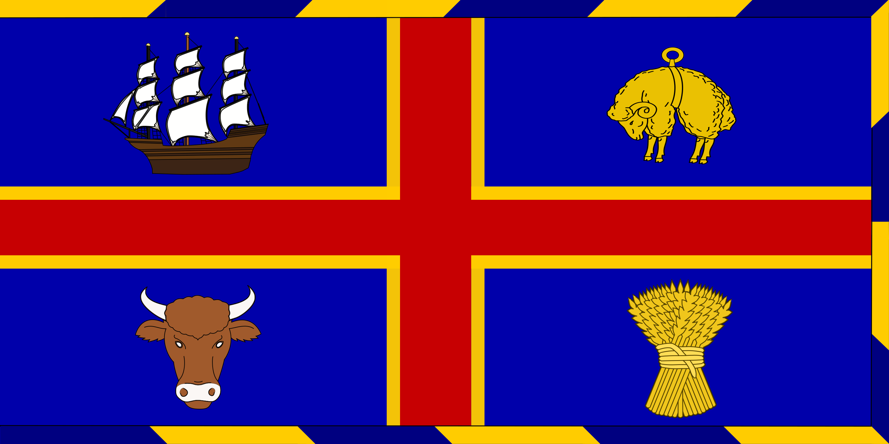
The worlds move liveable city from 2012 to 2017, with such famous landmarks as Flinders Street Station, the Melbourne Cricket Ground (MCG), and the Arts Centre. Host of the F1, the Australian Open, and the AFL Grand Final. Home of great coffee, and terrible flags...
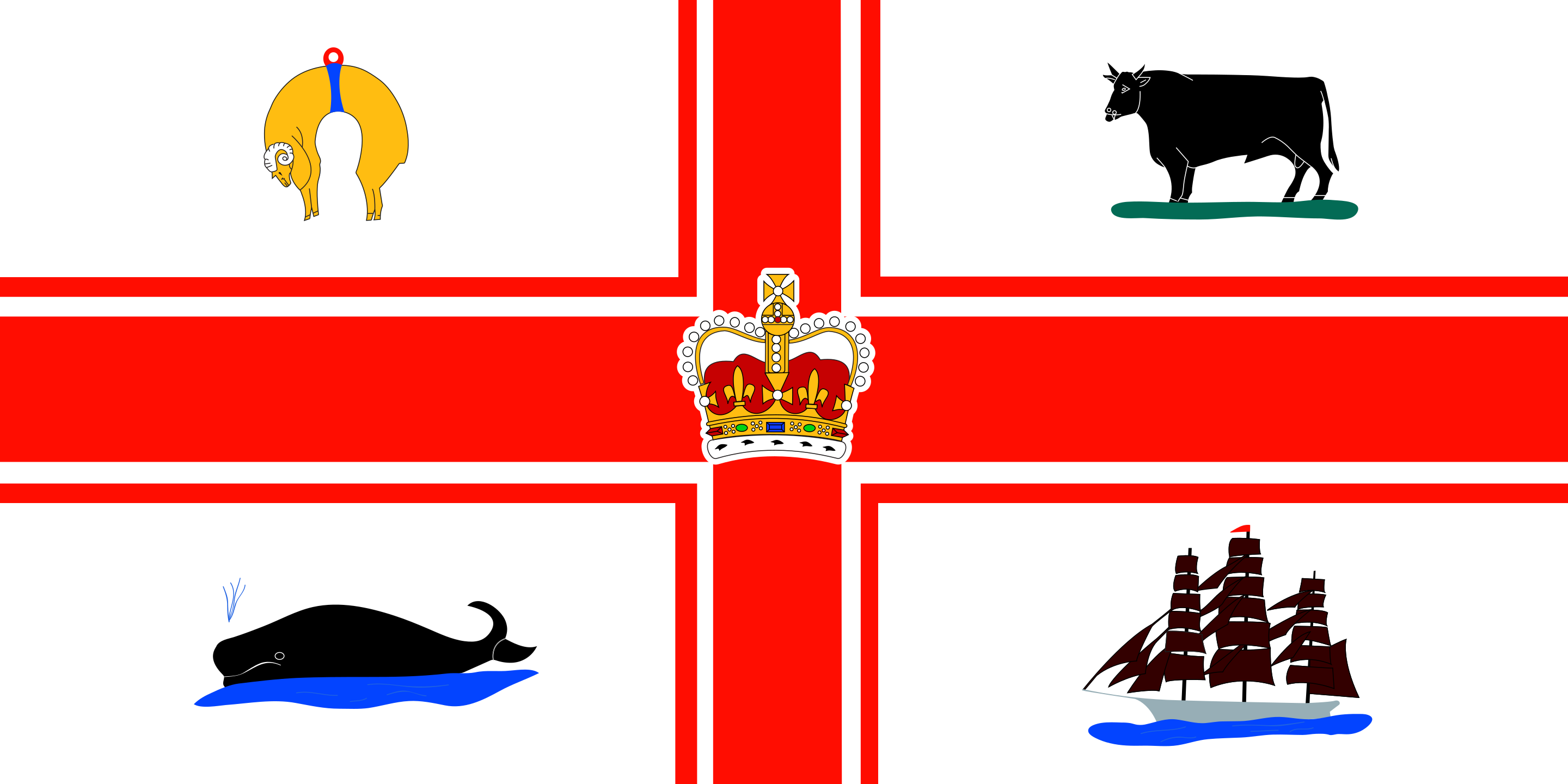
I know. I know. I know. Like what is going on in this flag? There's a bull, a sheep, a whale, an anvil? All meant to symbolise industries that NO LONGER EXIST IN MELBOURNE. Clearly we're in dire need of an update.
For a city that prides itself on art, sports, and culture our flag doesn't represent any of this. We need a new one, and since I'm not a graphic designer (have you seen this website?) I decided to get an AI to build a new flag instead.
There are two AIs that I shall be using in this experiment. Dalle-2, and ChatGPT.
Dalle-2 is a state-of-the-art (as of 2022) AI for generating images from text. For the technical reader it's what's known as a Gerneral Adversarial Network (GAN) and uses a training database curated by an expert team at OpenAI to ensure the highest quality images are used for generating results.
ChatGPT really needs no introduction at this point. When I originally started writing this post last November OpenAI wasn't a household name like it is today. In fact, it wasn't ChatGPT but rather GPT-3 that was making waves in the AI/ML community. When I was thinking about how to describe GPT-3 I had a whole paragraph about neural networks and autoregressive functions but there are many more detailed explainations of the system to I'll link to those instead. The one sentance explainer - ChatGPT/GPT-3|4 are a series of neural networks with a very well catalogued training set that creates a chatbot with "human-like" comprehension.
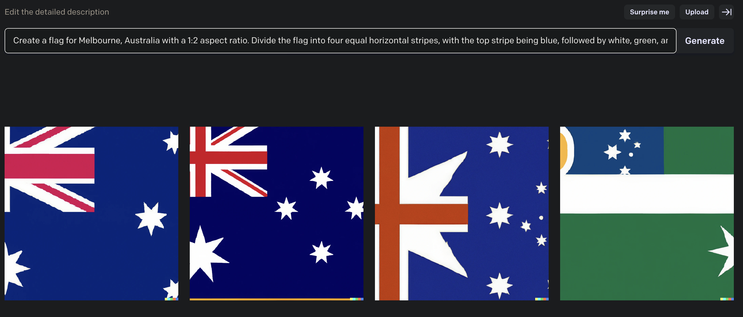
To begin with I started simple, I asked ChatGPT to make a flag for Melbourne.
And ChatGPT delivered...
Pretty good! It understood a lot about what I'm trying to do. In my other experimentation with Large Language Models (LLMs) I've noticed they're pretty good at picking out the main ideas of what I'm trying to do but don't understand some of the specifics. For example, the representation of the clock tower is not something that would work well on a flag, especially having the hands point to a specific time. In fact, I've never heard of this 6pm founding of the city before, I think the AI has become confused somewhere. Anyway, time to make a more specific declaration.
Pretty good, but Swans aren't a major icon of Melbourne.
Again, it's like it's choosing icons if you did a quick Google search of Melbourne.
Okay third times the charm, I can work with this. Originally I planned to put this prompt into Dalle-2, when I did I didn't get the results I was hoping for.
Definetly leaning on the Australian prompt a bit too much. I tried a few other varations of the prompt and I didn't get great results. I've found that while Dalle-2 is a great tool for creating abstract images it's not great at making vector based art like flags and icons when you're looking for very specific components.
I also gave Stable Diffusion a try as well and had very similar issues. I think this is going to be one of the main herdles for AI/ML engineers to overcome in the next few years.
So I went the manual path and made a flag using the results in Affinity Designer.
Like I said at the beginning, I'm not a graphic designer, but at least it doesn't have a sheep on it.
So the funny thing is, I went searching for the flags of all the other Australian capital cites, and they're all the same...
Not to be outdone by Melbourne, Sydney's flag is arguably worse... much worse.
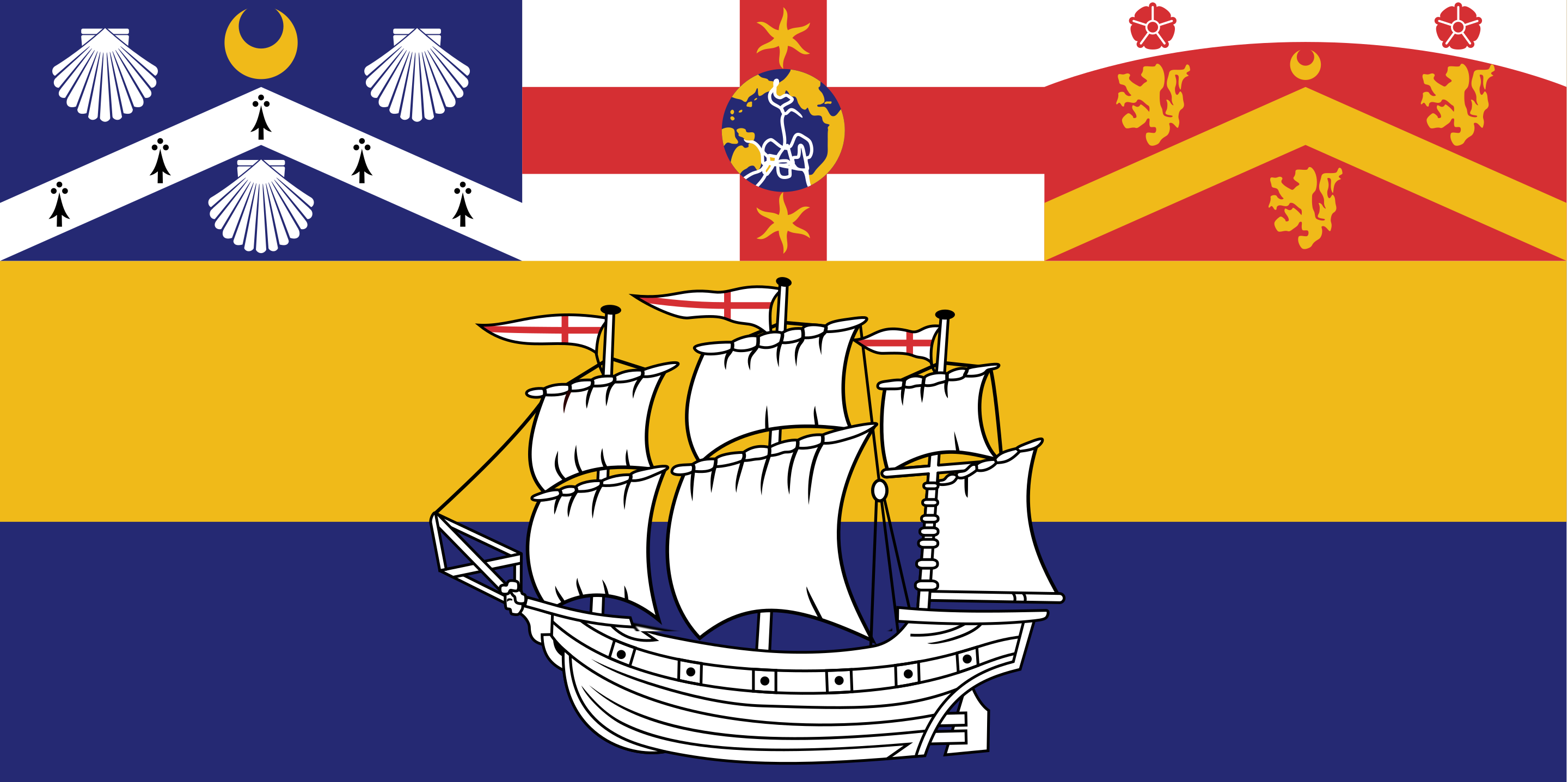
FOUR FLAGS IN ONE?! This flag is bonkers, Sydney, what are you doing! We can fix this. Let's ask our resident designer what they came up with.
Using me as an interface to draw ChatGPT came up with this flag.
Now in terms of flag design I think this fits all the criteria outlined by the North American Vexillological Association (NAVA), but there is something missing, you really can tell this was made by an AI and a software engineer with no design experience. Maybe I should provide some more context to the AI so that the design looks a bit better.
Moving onto round three, let's take a look at the sunshine state's capital, Brisbane.
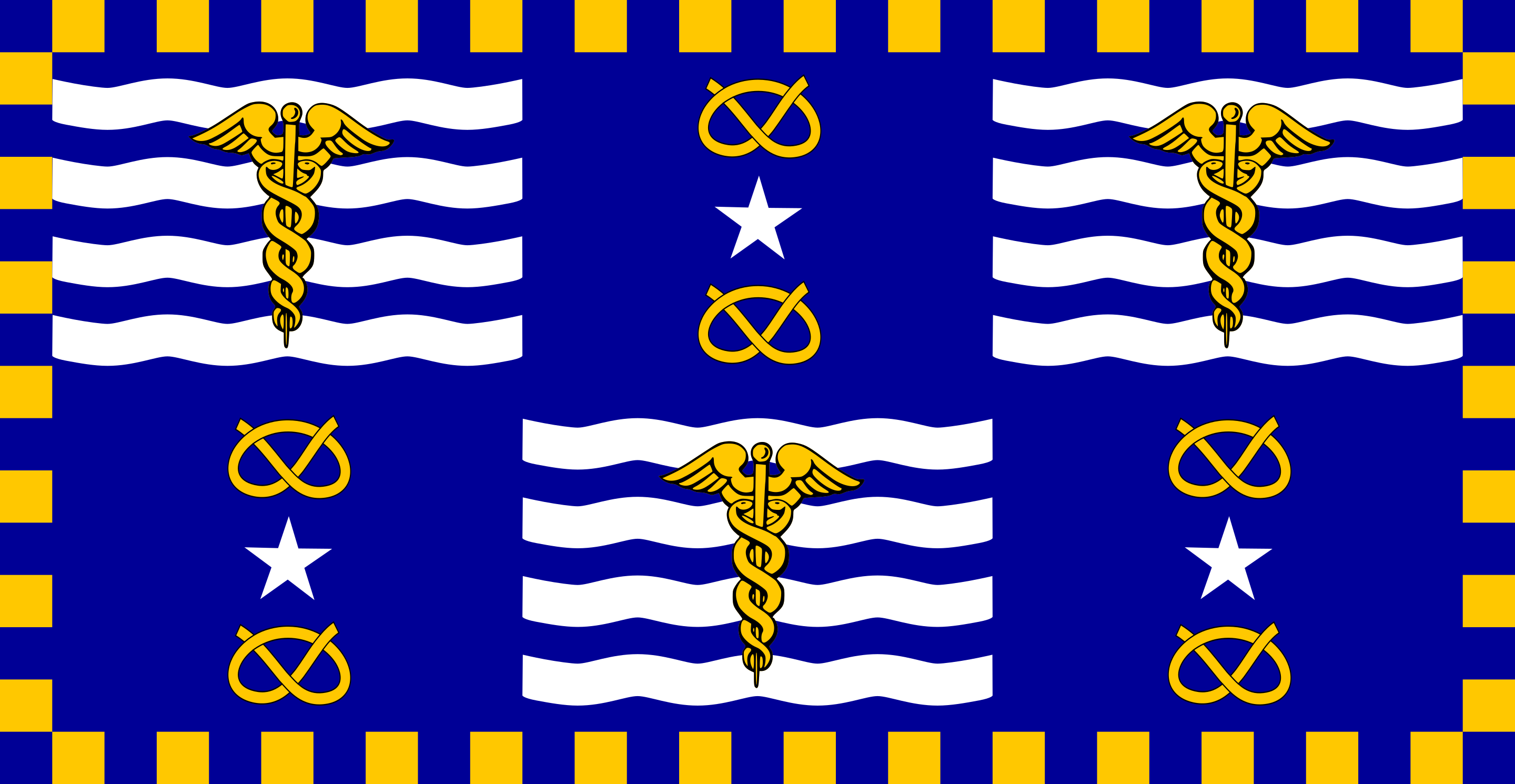
Oh yes, that's a flag alright. In fact I think it's six. It does have an interesting symmetry, of all the flags we've seen so far this is probably the best, but it's too complicated. I put the description of the flag into ChatGPT to see what it thought.
So now that ChatGPT knows what the flag looks like, what's its opinion of it? If you ask ChatGPT for an opinion it will tell you how as an AI it can't have any opinions. But if you ask it to rank based on a criteria it becomes much more helpful.
Well that's a pretty good breakdown of the flag, now what does it think we should do to fix it?
These are some pretty good ideas, let's get back to Designer to finish the job.
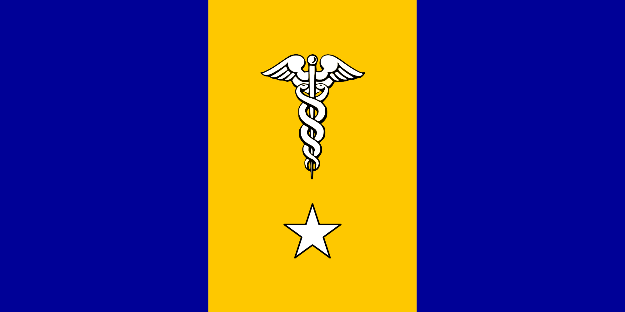
Not too bad if I say so myself. The design recommended by ChatGPT is simpler and maintains the core symbolysm - literally using the same Caduceus.
Also fun fact: the Caduceus seen on the OFFICIAL flag of the city of Brisbane is the one found on wikipedia!
I'm going to say that redesign was a success. While using the same colours and symbols ChatGPT has reconfigured the flag into something more flag-like for the citizens of Australia's sunniest capital.
Now onto the most "rad" city in Australia...
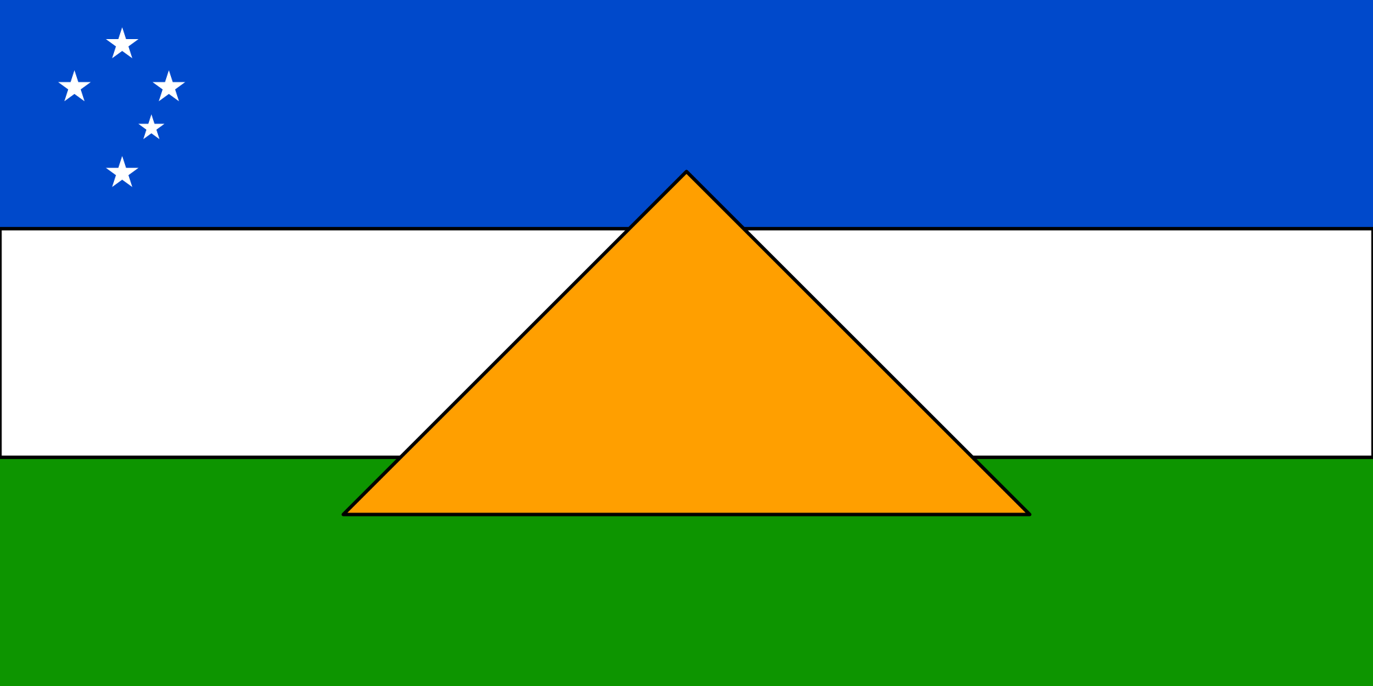
Oh (Rad)Adelaide, where the shops close at 4:30 and the city is surrounded by an impenetrable wall of gardens. I thought you were better then this. I really like the whole "can I borrow your homework" vibe I'm getting between the Melbourne and Adelaide flag. Let's have a go at this one.
For this flag I asked ChatGPT to pretend it was someone from NAVA.
This is quite a good set of instructions, my best attempt at creating the flag looks like this.
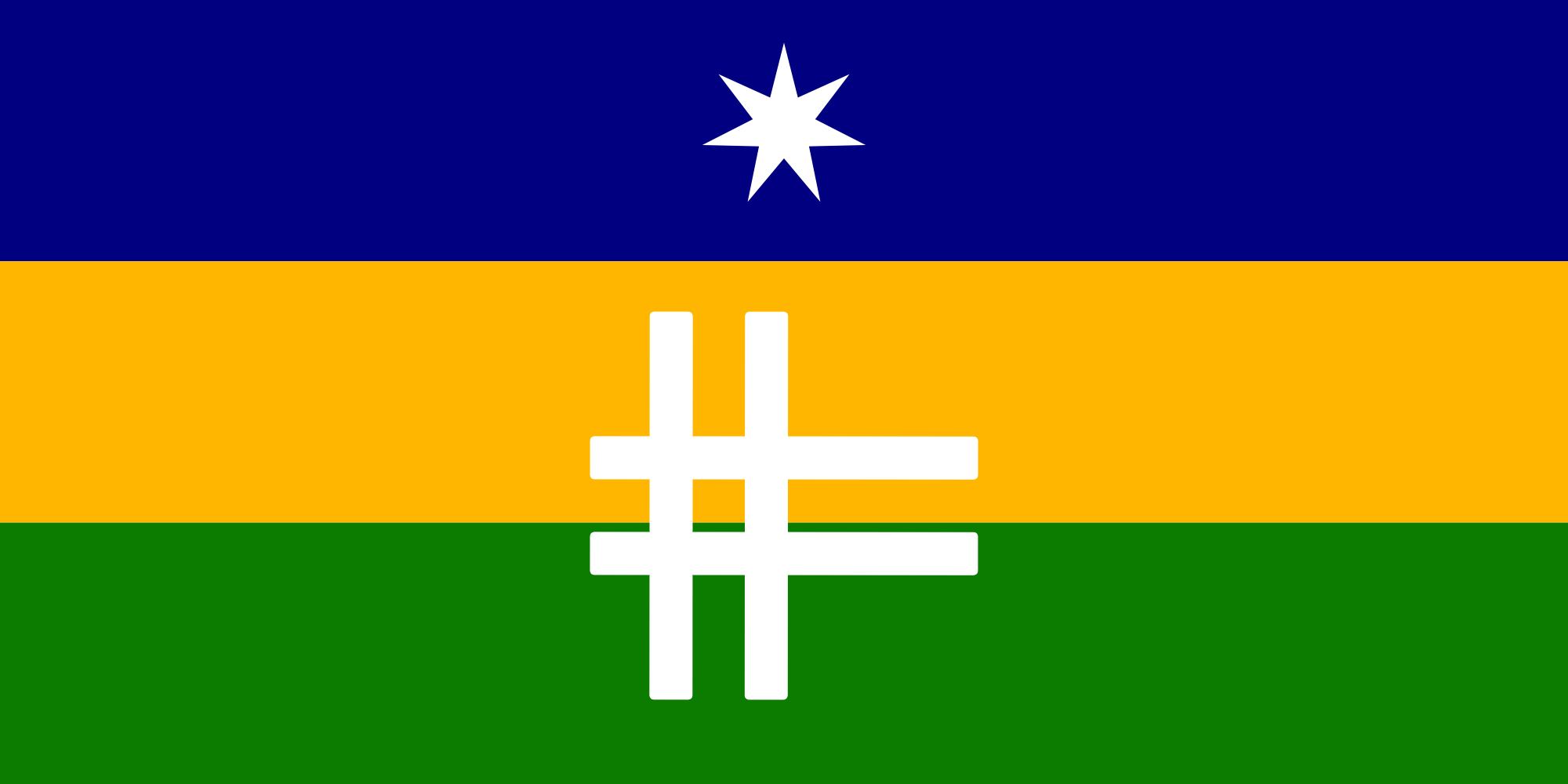
I think it's quite unique. The colour scheme and design is something I haven't seen on a flag in Australia before. It would stand out quite well in the Adelaide city center.
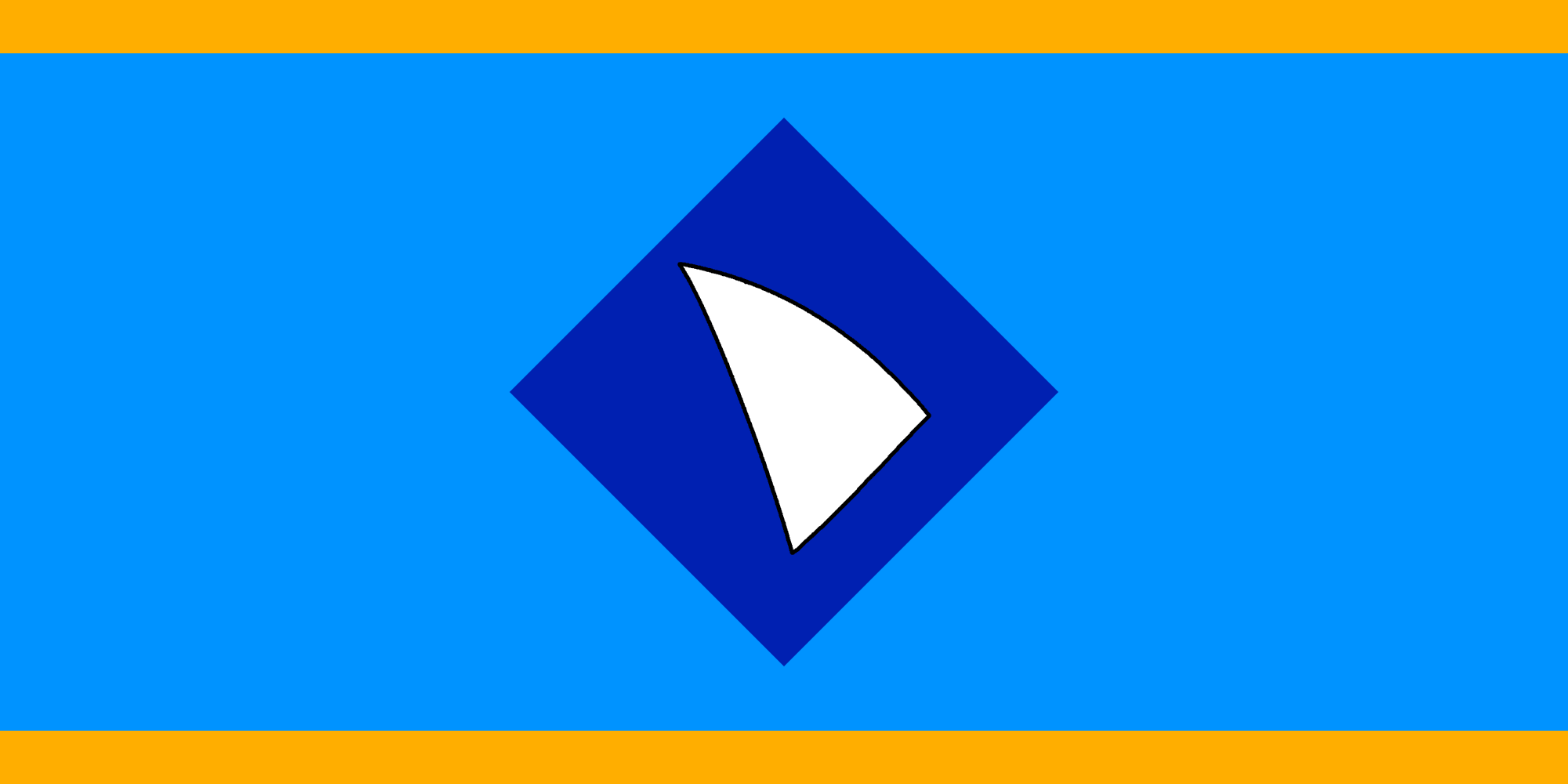
Lastly, we travel to the other end of the country, the most isolated captial city in the world, Perth.
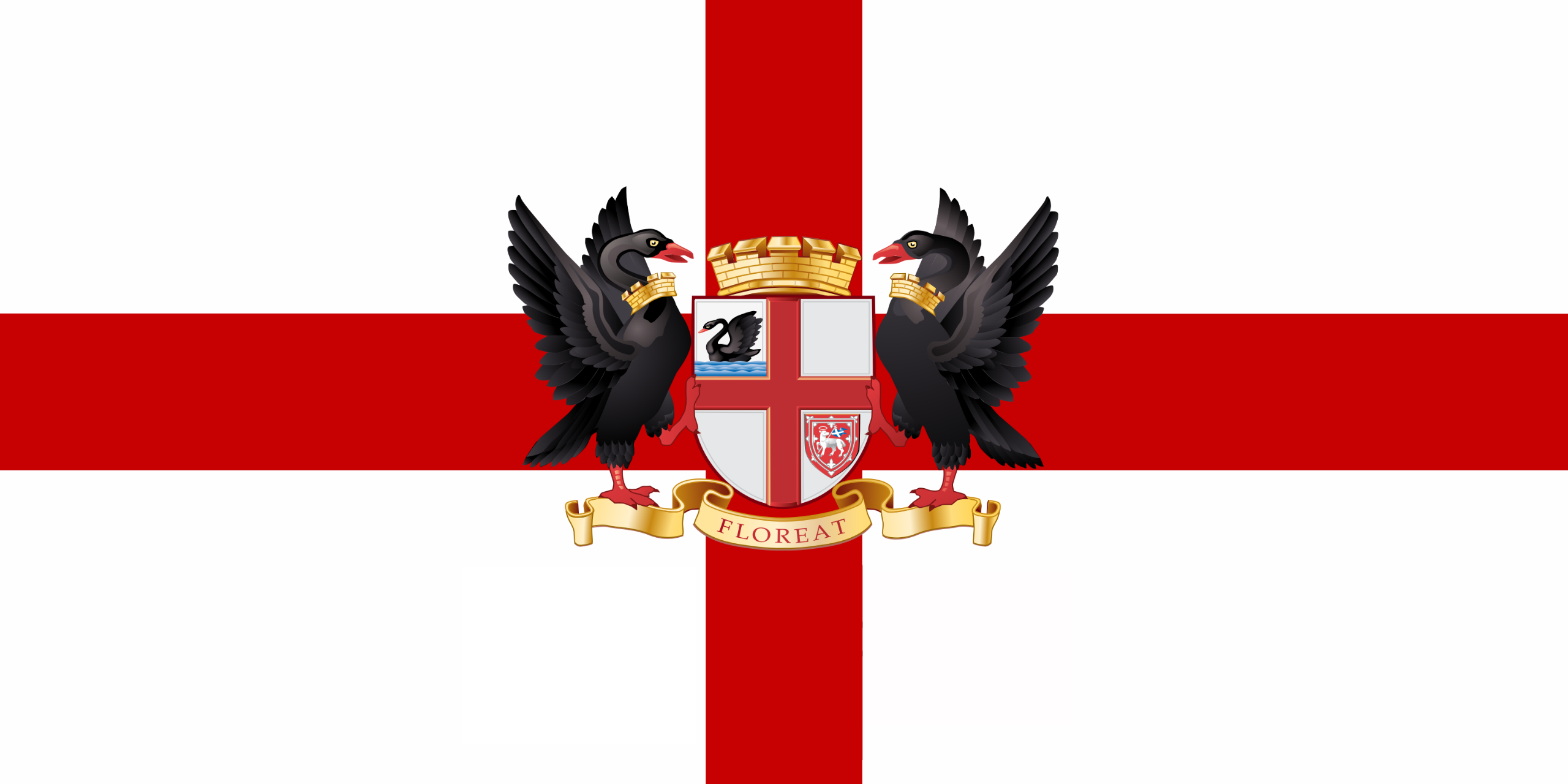
So I actually think there's not too much of a need to change the flag of Perth, it's pretty good, if not a bit generic with the cross of St. George and the seal of Perth, which is the only real big no-no. But the black swan is a very symbolic and famous representation of Perth.
For this flag I only asked ChatGPT to modify the current flag.
Okay not so much different from the current flag, I did have to provide a bit of prodding to get this suggestion.
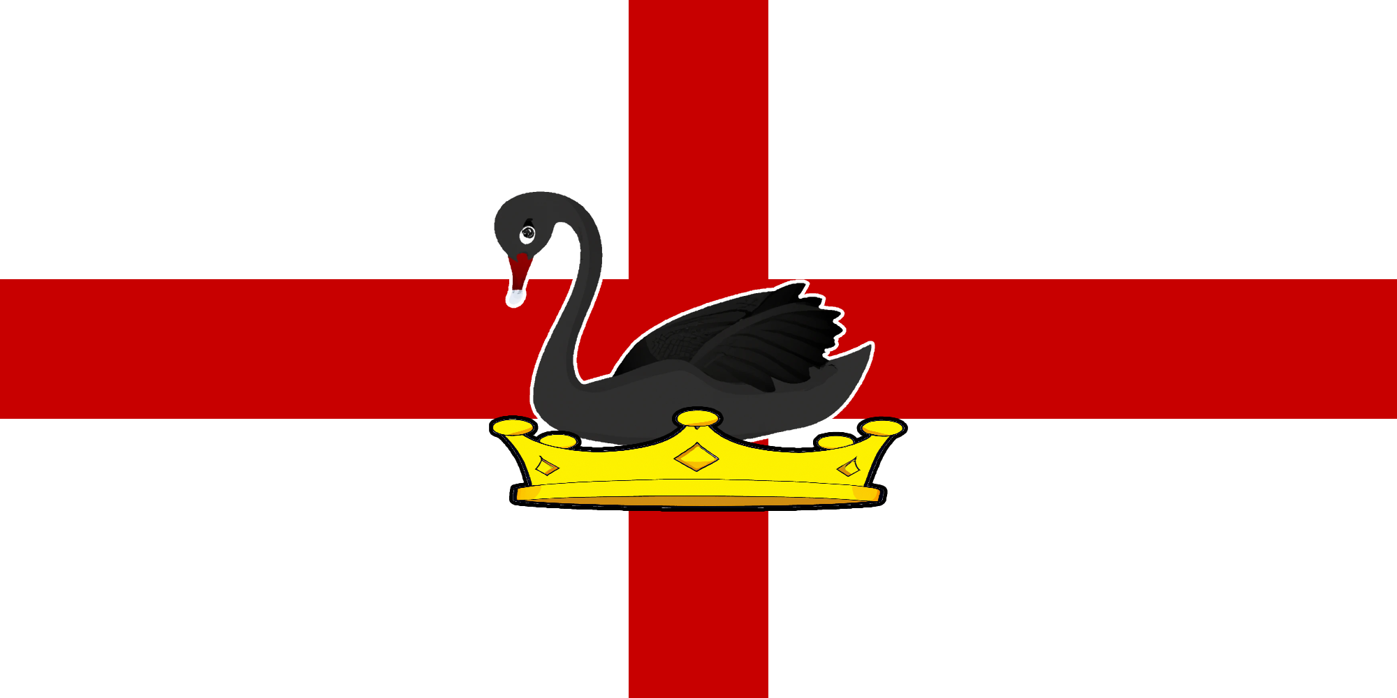
An elegant design for an elegant city.
I'm not entirely satisifed with the answers that ChatGPT gave and I can't really put my finger on why. So what can we learn from all of these?
I think the most interesting point I take away from this little exercise is how close the AI gets the designs to being what I would consider great but just misses out. I think it all comes down to context. The AI doesn't have an opinion about what looks good and what doesn't, the human mind is quite good at noticing small details which ChatGPT can't.
I think this experiment shows exactly why people are both horrified and apathetic to the advancements that are happening in AI. These AIs are really good at getting to a baseline level of skill that anyone might be able to do with a few hours/days of training, something like 80% of what an expert can do. But the final 20% which can take months, or even years for a person to accomplish is still out of reach for even the most advanced general AIs.
I guess we'll have to wait for GPT-5 to see if AI can reach the final 20%.